Hello, we are Aqwire.
Meet our new brand
The Aqwire symbol and wordmark
The Aqwire symbol
was inspired by 3 major things:
- Cross border, which is how we started.
- Send/Receive, which is the core of our business.
- The Letter A, which stands for Aqwire.
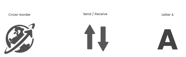

We combined these 3 symbols to build a unique logo
that represents our brand.
Wordmark
Aqwire’s new logo represents a fresher and more modernized brand.
The edges were lessened and replaced with round corners, which represent the smooth experience of paying with Aqwire.

How we sound
Smart, but not complicated. Confident, but not arrogant. Professional, but not rigid.
A warmer design approach
Aside from redesigning our logo, we also gave our illustrations, colors, icons and typography a fresh new look to make our customers feel our brand's warmth.

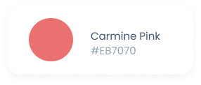
Our colors
We toned down our previous color palette to achieve a fun but corporate look.
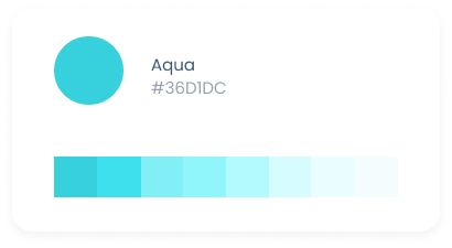
Our primary color Aqua belongs to the blue-green color family. It represents calmness, clarity and communication.
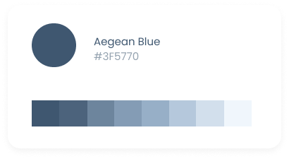
Aegean Blue is a blend of blue-green and gray. It represents casual elegance and versatility.


Typography
Poppins
Poppins is a Geometric sans serif typeface popular for building websites. Each letterform is nearly monolinear, with optical corrections applied to stroke joints necessary to maintain an even typographic color.
Our Brand Guide
We still got a lot of work to do and we will keep on improving this site for you. If you want to know the proper use of our logo and more about our brand, you can view and download our online Brand Book here.